Monday, February 17, 2014

Language of Flowers

...title of a book about a teenage girl with difficulty trusting and forming close relationships. She goes to work for a florist while still homeless and living in Golden Gate Park. Through the arrangements she creates for the florist's customers, a second and parallel narrative relates the emotional story. It's a good read and a treat for being set in San Francisco. 
The Language of Flowers: A Novel Paperback by Vanessa Diffenbaugh 
 https://www.etsy.com/listing/179522531/long-stemmed-rose-papercut-card?ref=shop_home_active_1

The newest trifold design is a long-stemmed rose. Red for romantic, passionate love; yellow for happiness and friendship(that would be my favorite); pink for affection; and white for congratulations, pride and forgiveness. These explanations are included on the back panel of the papercuts. The front panel is in full color and cut out completely; second panel backs the first and has an asymmetric pattern. Fits a legal envelope so it can be mailed (bonus)

I've had this idea in the back of my mind for awhile. Decided not to make a blue rose, which is a reference to The Glass Menagerie because it seems so sad. If you haven't read it (spoiler alert) the blue rose is a play on the word pleurisy and in fact, was inspired by Tennessee Williams' sister, Rose...so the reference comes full-circle. Read more: http://www.garydexter.blogspot.com/2009/11/161-glass-menagerie-by-tennessee.html

Sunday, February 9, 2014

Turtle Tableau


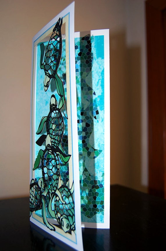
(That word tableau is tricky. Kind of like the word once. Sometimes it just doesn't look like the letters are in the right place.) This trifold papercut card is of the hatchling turtles making their way to the ocean. They get eaten in large numbers before reaching the water. I wanted the shell and the background showing through the front panel of papercut to be different and to refer back to the actual substance of sand and carapace. Check out the wiki article on turtle shells: http://en.wikipedia.org/wiki/Turtle_shell
Quite interesting and complicated. I used a mosaic pattern that merges with the water on the backing, i.e. second panel so that it looks like the turtle cluster just below the surface of the water or their shadow from above.


Year of the Horse 2014

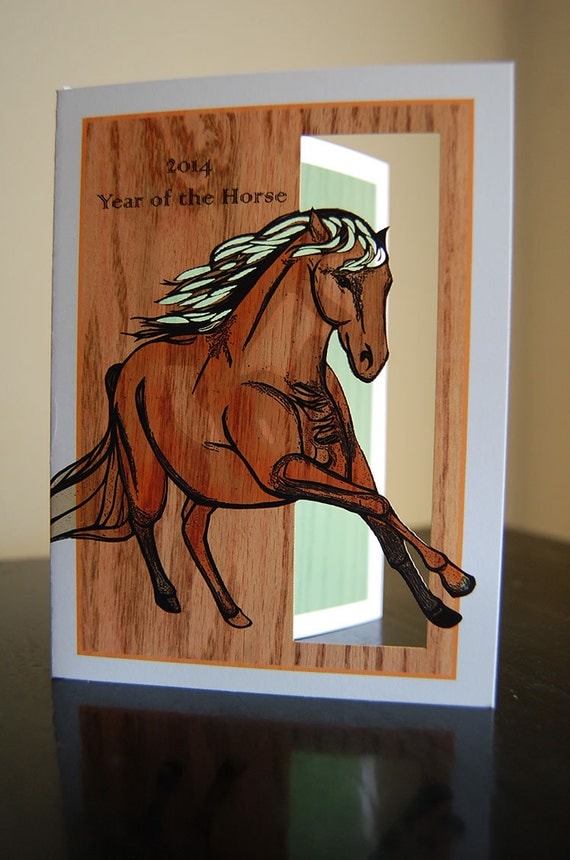
 Year of the Horse 2014 (papercut card)

Year of the Horse Green w/ Wood Element
https://www.etsy.com/listing/177556737/year-of-the-horse-2014-papercut-card?ref=shop_home_active_7
The revisions have gotten sorted out and will be published this week. Slight variations but I hope to reprise the horse for a "golden" hills of California POPup-foldOUt that will feature artichoke thistles. Not sure if these came with the Spanish and their cattle in the 1500s. This is an oddly Gothic-in-the-daylight plant with blooms a beautiful purple that dry and blow off the ramble of spiny leaves becoming golden puffs. These create a texture to the hillside and make it fairly impassable.
Or...of coyote. The newest iteration has more cuts and swirls in the mane. I've been making the little enclosure envelopes out of red patterned scrapbook paper. The small enclosure card and envelopes are for money gifts. This is traditional and these usually go to children in the family.
A conversation developed with another papercut artist, based in New York City.
Her etsy shop is jerise.etsy.com
https://www.etsy.com/shop/jerise?ref=l2-shopheader-name

She has organized a Year of the Horse card exchange. I'm looking forward to the exchange and wish you a happy and productive 2014

Cup of Beautiful

February 9, 2014
Year of the Horse.
last night, I was watching a local tv program that highlights the arts. It's on KVIE and airs Saturday night, 7PM. Has a ton of really good stuff and is hosted by the same guy, Rob on the Road. Here's the link http://www.kvie.org/programs/arts_entertainment/default.htm

One of the segments in the program features Olympia Dukakis, reprising her role in a theater production of Mother Courage. During the interview...at the end of the interview she quotes a poet. (forgive me but what I heard was  Locker, Lokker, Lacher???! so in search of this lovely passage, replaying the clip and googling it word for word, found it! The Spanish poet, Frederico Garcia Lorca, wrote:


...the poem, the song, the picture are drawn from the well of the people(s) and should be given back to them in a cup of beauty so that they shall know themselves.

This seems a good underpinning. My uncle said that there are a couple ways to take a walk. Some people walk the same way every day observing and interested in what has changed on that walk. Some people take a different route to see new things than they had the day before. Often for me, it's good to have a purpose, an endpoint or a circuit  then I relax along the way. Working is often like that.


Gray Whale Off the Coast

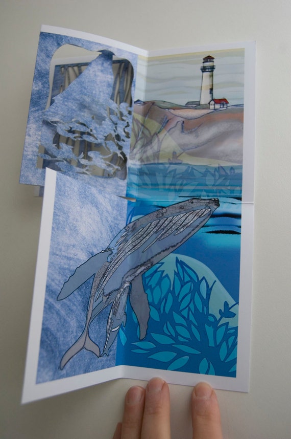
The gray whale foldout is the next iteration of the foldout that went out to Rhode Island in August.
The design is more dynamic and has those fish again and a watercolor-up-through-the -depths landscape of the lighthouse. The colors are more vivid and has more ink coverage. There are also two variations. One is of the whale moving up through the kelp and the fish. The second shows it breaching and a wave curling up out of the surface. Highly stylized but hey.
https://www.etsy.com/listing/172089290/gray-whale-breaching-popup-foldout?ref=shop_home_active_22

Gray Whale Breaching  (POPup FoldOUT)

Gray whale migration off the coast of California


Monday, August 26, 2013

Whale Song, New, Newer Work

I have a new foldout in the web shop. It's titled Whale Song, which may be referencing some audio collection in my subconscious with whale calls. Sperm whales make clicking sounds that some researchers theorize is echolocution since they don't seem to have good vision. The foldout was created or rather finalized for a gallery in Rhode Island, i.e. Ambergris Gallery on Block Island. Gillian, the owner asked me if the new work...whale foldout depicted a sperm whale. The initial foldout sketches and file is of gray whales and I may drop in those images for a dual whale work. The sperm whale has such a blocky profile. Ink coverage has spread out over the surfaces.

It really helps to have a deadline. It's uncomfortable but it really helps to push the working.

Thursday, September 8, 2011

Lifting questions and writing the answers

These questions came from LinkedIn discussion board for illustrators. Someone named the "illustrator dude" with a robot-thing was canvassing members to interview. The following are my answers to the interview questions. I decided to interview myself.

Interview Questions:

When did you start illustrating?
I got fascinated with the "process" of drawing. and possessed enough detachment from the results that I used a ballpoint pen. It was all very fluid.

How would you describe your illustration style?
I have a distinct line style that dominates everything I do much like individual handwriting.

Where do you find inspiration?
the natural world, some odd quirk observed, music...music is universal isn't it.

What’s your software of choice?
Photoshop

What’s your favorite focus food?
...what does "focus" mean? A food that one is fixated, have a yen for or a food that imbues a sense of contentment, calm and concentration?
Odd question. probably coffee for focus. It has a ritual aspect that is linked to so many memories.
What’s your favorite thing to draw and why?
animals

What illustrators do you look up to?
Elise Kleven. I love her storytelling and the looseness of form and color through paper collage.
There are several children's book illustrators that make my heart happy.

When do you work best, early in the morning or late at night?
mental function and energy are best in the morning though sometimes it takes me some puttering around to get really productive and always I work better with a medium-range deadline. Deadlines create the necessity to make decisions and to finish.

What are your illustration goals for the next 2 years?
develop new work that uses collage as a substrate providing richer textures and depth; create a body of work made up of limited large format papercuts; work more quickly, create and render more ideas; purchase a lasercutter for stained glass compositions and more paper art; find that sweet combination between art and product that creates a sustainable income and recognition.